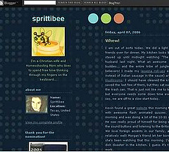
I read an interesting article and some comment debate on what makes a great blog sidebar. I think “Good and Bad” in blog design is subjective to personal preferences and somewhat effected by blog purpose. If you are a high-tech blogger, you probably won’t be as interested in “fellowship” like a homeschool mom will be. Those types of bloggers prefer clean, simple, easily navigated sites with rss feed buttons and less blogrolls. Homeschool moms tend to gravitate to the more personal blogs which show a part of the blogger’s personality and tell about what type of person they are. In case you just stopped in for the first time here at Sprittibee, I had my blog redesigned this month (here’s a shot of what it used to look like):

I’ve had blog design on the brain for quite a few months now…. so I thought I would share with you what I like to see in other blogs:
GOOD:
Quick Loading – Scripts from code that you place on your sidebar slows your blog down. My web designer said that I had a lot of scripts before my redesign; and she deleted many of them and moved the sidebar under my content so that my content loaded FIRST – making my blog seem to load quicker for my readers.
Originality – I like seeing different templates than I have seen before. This is one of the reasons I gave up my pre-fab blogger template and hired a designer to make me something of my own. I love seeing the way people create “extensions of themselves” by way of interesting blog templates that tell you about their personality.
Good Design – pleasing to the eyes, color coordination, repetition or theme, easy to read, good separation between posts, organized sidebars and NOT TOO CROWDED. I read a cute article about the rules of good web design (which fall neatly into the acronym: C.R.A.P. – How C.R.A.P. is your site?)
Here are a few unique sites with not only originality,
………but good design as well:Amy’s Humble Musings
PHAT Mommy
Mark Bixby
Scrapalicious
Veerle’s Blog
LJC FYI
MomAdvice
Down in Texas
Farmgirl Fare
Okay SamuraiI could go on and on… there are so many great sites…but you get what I mean. I’d love it if you shared a few of your favorite-ly designed blogs in my comments section!
Search Boxes – I love to be able to easily find what I’m looking for without scrolling through endless archives.
Your Photo – Let me see who’s talking! Photos put a personal touch on your content.
Purpose – What’s the mission of your blog? Are you a Christian? I like to know those kinds of things up front.
Photo Links – I enjoy browsing other people’s photos (especially other homeschoolers and crafty people who take pictures of their projects).
Blogrolls – You can go overboard with these, but I like to see what other people are reading. Not necessarily their affiliations and such, but their own personal favorite blogs. I have found many interesting blogs by clicking in other bloggers’ favorite blogroll lists.
Your Name/Screen-Name – When you are trying to link to a post on someone’s blog, you usually like to say… ‘So-in-so over at So-in-so Blog said, “This”.’ It makes my life easier if I can easily see who So-in-so is without the prolific reading of fine-print.
Retractable Blogroll Lists – Danny at JackLewis.net has shared his code for making your longer blogrolls retractable or ‘hidden until clicked’. On longer lists that I am on (like Pro-Life Blogs), I can easily leave the option for others to view that list by tucking it away (neatly out of sight)… and yet still have it be there to give all those other bloggers ecosystem points.
Site Meter – I love my site meter. I had three previously; but after a year, am finally deleting one of them because of it’s embedded script that was slowing me down. I think it is nice to view other site meters sometimes as well. There’s something open and honest when you find a blogger willing to share the gritty details with anyone interested. I have also found other interesting blogs and links through my site meter.
Tip Jar – I don’t always leave tips for people… but if I love your blog and am a repeat visitor for a while, who’s to say I won’t win the lottery and want to share my joy? [Note to readers: You have to play the lottery to win, so therefore I can’t win and this is just an analogy to make a point.] I can honestly say that my tip jar has not made me rich, but I will disclose that some nice readers put enough money in there to pay for about 5.53% of my blog redesign. Why not have a tip jar to help with hosting costs or just to buy a nice book once or twice a year from Amazon?
Thanks to Glenn of Unite Later, My Boaz’s Ruth of A Dollop of Sour Cream, and Cindy of Obstreperous Heart (who’s husband happens to be a web designer) for their generous donations which went to help pay for the design! Thanks also to my KONOS mom buddies out there who may not have blogs, but shared a few handfuls of spare change in exchange for the use of my PDF planner and such.
About Section – I just recently added a personal About Section to my blog because I have so enjoyed them on other bloggers’ blogs. I know that Blogger offers a canned About Me section, and it is nice… but a personalized one is even better. I kept both links on my blog because I know that I enjoy reading about the person who’s writing! You can access my Blogger About Me section by clicking my photo, and my personal About Me section is now under the About Tab directly to the right of my current post.
Contact Section – It’s always nice to know how to get a hold of the author if you have questions or suggestions.
Favorite Posts – This may seem to be vain on the surface, but if you know that there are ten posts which tend to be your most popular posts, maybe you should consider adding them to a Most Googled/Favorite Posts section in the sidebar? I have added a list of my favorite posts in the top of my sidebar for those who are returning and looking for something in particular… or for those who are browsing and might be interested in something other than the most current posts. It also is handy for myself if I need to refer to them.
BAD:
Insanely long graphic links to books that you are reading or have read. If you want me to look at those, please put them in a post and link the post on your sidebar. I have never bought a book through an Amazon link in a sidebar. I have, however, considered buying a few which were reviewed in a post and linked there.
Tons of advertising. If I had money, I’d be out using it to do extra-curricular things with my kids or using it to hire a maid so I could have more fun at home with them. I read blogs in my spare time to connect with other homeschool moms, get news, find out what other homeschoolers are doing, and get craft ideas for school. I rarely click on advertisements. In this case, less is definitely more.
Buzz Words: Site Design, Opinion, Computer, Presentation, Visitors, Blog Issues, Preferences, Template, Web, Review, Design, Blog, Graphics, Advice, Technical, Blogging, Sidebar

Looks very nice. If you don’t mind (perhaps I missed it?), who did the work?
Thanks Daryl. Natalie Jost did the work. She’s excellent. Her link is in the bottom of my sidebar.
Great post! As a new blogger I love reading these suggestions! It certainly makes figuring out some of the many do’s and dont’s of the blogosphere easier!
Thanks Diana. Your blog is very unique for a “green” blogger. 😉 You already have great content and a cute title block. I enjoy hearing about your little wee ones.
Thanks for the tips! I am wanting to redo some things on mine when I find some spare time…….. I really like the clean look on yours!
Really really bad — Music that starts playing as soon as the blog opens. This is enough to keep me from coming back if it continues. I read blogs in all sorts of situations that somebody else’s choice of music coming out of my computer is NOT appreciated.
Also bad (And one thing I really like about your new design) — White text on a black background. It’s harder to read. The text is “fuzzy”
I agree with you about books in sidebars. I do reserve books/buy books because of reviews in blogs. But I just skim over the sidebar looking for the good stuff (links to other blogs)
You are most welcome KarenW. Romania! How very interesting and wonderful! I would love to travel abroad. I’d like to visit Italy, France, India, Thailand, England, … etc….. and know a few missionaries myself. I love to read their update letters. How many languages do you speak?
My Boaz’s Ruth – OH YES, I forgot the music. YES, it bothers me, too. I don’t mind them putting an OPTION for you to click and play it… but I don’t like it to come on without warning. However, this site is really cute and I love the music and the little sound the links make when you hover over them. Too cute! French Kitty dolls are groovy. We have a thing for cats in this family.
Sorry I was torturing you with the white on black text. I like it both ways… but I agree that snow white on black is painful. I think I had a creamy color before so it wasn’t sooo bad… but you tell me!?
I can’t wait until we buy another house. My husband is a computer guru and can set up a web server for me. We have one collecting dust on the floor in the hallway (only useful for stubbing toes and stacking laundry before it goes in the closet at the moment).
Thanks for the compliments on the design of our blog. I will definitely pass those on to my husband who designed the blog & site!
I am throughly enjoying reading your blog and really love the look & feel of it.
I agree about the music, my boaz’s ruth. I immediately shut the browser if there is music- particularly being assaulted by really BAD music!
Thanks again!
Thanks so much. Amy! You look so pretty and YOUNG. Your husband does an excellent job at web design. Maybe next year when I decide to change things up, you can see what he would charge a poor homeschool mom to have a re-design done. 😉 For now, though, I really love the new look and I’m going to have a lot of fun with this template. One day my computer geek husband (God bless him) will hook up our un-used server that’s collecting dust in the hallway and I might try using some other blogging platform instead of Blogger. For now, I’m not going to fix what ‘aint broke.
I appreciate you popping in to comment. Congrats on 9Rules. I’d love to be a part of their group.
See, it’s 11:20 and the Seahawks game doesn’t start until 1:30. Thank you so much for directing me here. Some great ideas. Not on your list but I’ve added the “You Comment/I Follow” to Lee’s blog. Love some of the sample designs.
Matt (Lee’s husband)